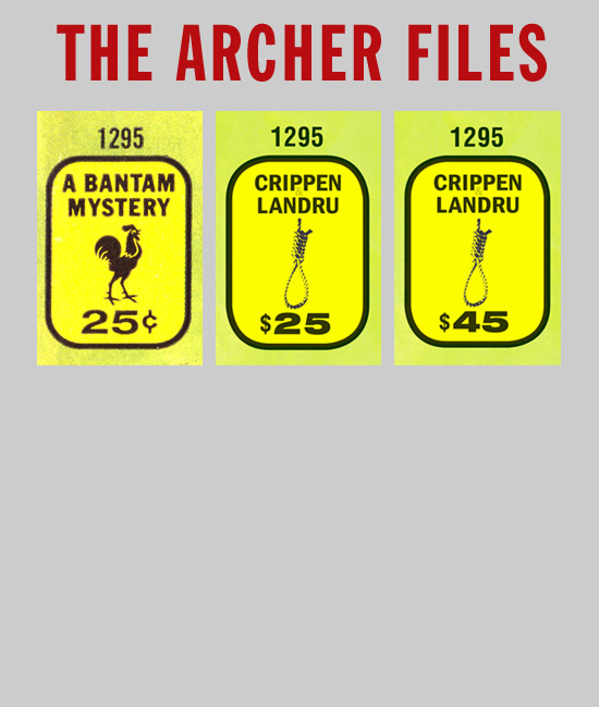
The instances where the Trade Gothic and Franklin Gothic fonts appeared worked out well. Adjustments in tracking, scaling, and kerning were possible so that a good match to the feel and look of the original cover type could be made. Unfortunately, I didn't have a version of Helvetica Neue with the correct lineweight available to me for the 25¢ price. I had ones that were too light or a little too bold to tweak. If I was going to sacrifice a bit of authenticity, opting for a little too bold seemed preferable. The pricing on the softcover of The Archer Files parallels the original better visually than the limited edition hardcover. Doug Greene was gracious enough to allow me to create custom versions of the Crippen & Landru logo so that I could have the entire package come across as looking like a Bantam paperback. I'm grateful to Doug and Tom for indulging my idea to carry the project to the logical extreme by giving me complete freedom to ape the front and back covers, spine, and title page of The Name is Archer.